Table of Contents
When it comes to remodeling a kitchen, wall color plays a huge role in setting the tone, tying together finishes, and complementing cabinetry, countertops, and flooring. Neutral paint colors remain a top choice for homeowners because they offer flexibility, timelessness, and a clean backdrop for both traditional and modern design styles. In this blog, we explore ten of the most popular neutral Sherwin-Williams paint colors for kitchen walls—colors that work beautifully in a variety of home styles and lighting conditions.
Agreeable Gray (SW 7029)
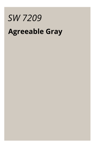
Undertones: Greige (gray + beige)
Light Reflectance Value (LRV): 60
Agreeable Gray is Sherwin-Williams’ most popular neutral for a reason. It strikes the perfect balance between warm and cool, making it a chameleon-like backdrop in any kitchen. This versatile greige adapts to both natural and artificial lighting and works well with white or wood cabinetry.
Why it works in the kitchen: It softens harsh lighting and coordinates beautifully with stainless steel appliances, subway tile backsplashes, and marble or quartz countertops.
Best paired with: White trim, oil-rubbed bronze fixtures, and medium-tone wood floors.
SW 7042 Shoji White – A Modern Warm White
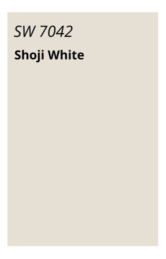
Undertones: Creamy white with a hint of gray
LRV: 74
Shoji White is the answer for homeowners who want a light, airy look without veering too stark. It reads as a soft off-white with beige-gray undertones—perfect for modern or Japandi-style kitchens.
Why it works in the kitchen: Its subtle warmth makes it ideal for open-concept spaces and complements wood tones, natural textures, and matte black accents.
Best paired with: Light oak cabinets, concrete-look countertops, and matte black hardware.
SW 7036 Accessible Beige – The Cozy Neutral
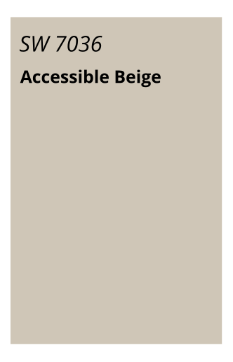
Undertones: Beige with gray influences
LRV: 58
Accessible Beige is a welcoming neutral that leans slightly warmer than Agreeable Gray. It offers a touch of depth while remaining calm and soft, making kitchens feel grounded and inviting.
Why it works in the kitchen: It enhances cozy, traditional kitchens or those with creamy countertops and natural stone accents.
Best paired with: Walnut cabinetry, brushed nickel finishes, and earth-toned tile.
SW 7008 Alabaster – Soft & Serene White
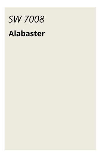
Undertones: Creamy, warm white
LRV: 82
Alabaster is a timeless, award-winning white that remains a designer go-to for kitchen walls and cabinetry. With a touch of creaminess, it avoids the starkness of pure white while keeping the space bright and elegant.
Why it works in the kitchen: It reflects light beautifully, making smaller kitchens feel open and spacious. It also pairs well with both traditional and modern cabinet styles.
Best paired with: Shaker-style white cabinets, gold hardware, and Carrera marble countertops.
SW 7030 Anew Gray – A Balanced Mid-Tone Neutral
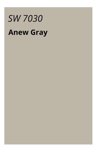
Undertones: Warm greige
LRV: 47
For those who prefer a slightly deeper, more dramatic neutral, Anew Gray offers a refined yet comfortable aesthetic. It walks the line between gray and beige with a rich, grounded presence.
Why it works in the kitchen: This color works especially well in kitchens with ample natural light or white cabinetry, creating contrast without being overwhelming.
Best paired with: White shaker cabinets, black pendant lighting, and medium-tone wood floors.
SW 7015 Repose Gray – Cool & Contemporary
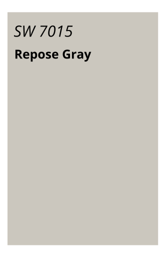
Undertones: Light gray with subtle violet and taupe
LRV: 58
Repose Gray is a cool, soft gray that reads clean and crisp in kitchen spaces. It’s a top pick for homeowners wanting a neutral that leans slightly cool without feeling cold or sterile.
Why it works in the kitchen: Ideal for contemporary or transitional kitchens, Repose Gray pairs beautifully with sleek cabinetry and modern tile.
Best paired with: Matte black hardware, slab-style cabinets, and geometric tile backsplashes.
SW 7005 Pure White – The Clean Classic
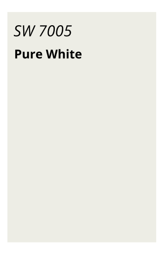
Undertones: True white with slight warmth
LRV: 84
Pure White is exactly what it sounds like: clean, fresh, and crisp. It’s one of Sherwin-Williams’ most popular whites for trim and cabinets, but it also works beautifully on kitchen walls.
Why it works in the kitchen: It reflects natural light, enhances the perception of space, and gives kitchens a modern, gallery-like feel.
Best paired with: High-gloss cabinetry, quartz countertops, and chrome fixtures.
SW 6385 Dover White – A Creamy Classic
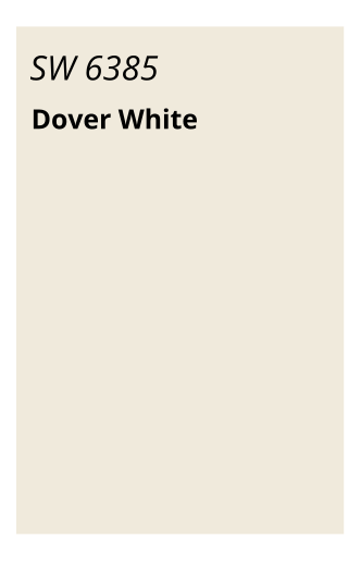
Undertones: Warm yellow-beige
LRV: 83
Dover White is a buttery, inviting white that offers a sense of comfort and tradition. It’s perfect for farmhouse and French country kitchens that favor warmth over stark contrast.
Why it works in the kitchen: It complements antique finishes, natural wood tones, and vintage hardware beautifully.
Best paired with: Cream or ivory cabinetry, butcher block counters, and brass hardware.
SW 7632 Modern Gray – Understated Sophistication
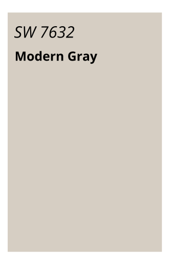
Undertones: Warm gray
LRV: 62
Modern Gray is a subtle warm gray that feels elegant without demanding attention. It’s less well-known than others on this list, but quickly becoming a favorite among designers.
Why it works in the kitchen: Its soft character makes it an ideal background for layered neutrals and textured materials like shiplap or stone tile.
Best paired with: Textured tile, concrete counters, and wood shelves.
SW 9109 Natural Linen – Light & Livable
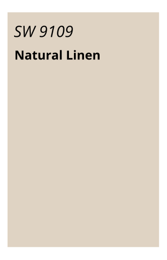
Undertones: Beige with slight pink undertones
LRV: 66
Natural Linen is a soft, elegant neutral that’s ideal for homeowners who prefer beige over gray. It brings warmth and comfort to a space without looking dated.
Why it works in the kitchen: It’s perfect for traditional kitchens with off-white cabinets and adds an inviting softness to large, open spaces.
Best paired with: Creamy cabinetry, bronze fixtures, and hardwood floors.
Tips for Choosing the Right Neutral for Your Kitchen
Lighting Matters: North-facing kitchens may benefit from warmer tones like Dover White or Accessible Beige, while south-facing kitchens can handle cooler tones like Repose Gray.
Sample First: Always sample paint on multiple walls. Colors can shift dramatically depending on time of day and lighting conditions.
Cabinet Pairings: Consider the undertones in your cabinetry when selecting a wall color. Cool-toned cabinets pair best with cool neutrals, and vice versa.
What Neutrals Are Trending in 2025?
In 2025, warm greiges and soft off-whites dominate kitchen color trends. Homeowners are leaning toward cozy, nature-inspired palettes that create welcoming, grounded spaces. Colors like Shoji White, Alabaster, and Agreeable Gray remain popular thanks to their adaptability and timeless appeal.
FAQs: Choosing Kitchen Paint Colors
Q: What’s the best Sherwin-Williams color for a small kitchen?
A: Alabaster or Pure White are excellent choices because they reflect light and make a space feel more open.
Q: Can I mix neutral paint with bold cabinetry?
A: Absolutely. A neutral wall color like Repose Gray or Shoji White can beautifully balance bold cabinet colors like navy blue or forest green.
Q: How do I make neutrals feel interesting?
A: Layer in textures like beadboard, natural wood, matte finishes, or open shelving. Add contrast with black hardware or colorful art.
Final Thoughts: The Power of a Neutral Palette
Neutral kitchen walls are anything but boring. With the right Sherwin-Williams color, you can create a space that feels calming, cohesive, and elegant for years to come. Whether you’re after a warm, creamy tone or a soft greige backdrop, these 10 colors offer the flexibility and timelessness that homeowners crave.
Ready to Start Your Kitchen Remodel?
If you’re located in Crystal Lake or the surrounding Chicagoland area, our team at CSL Interior can help you design a stunning kitchen tailored to your style. Reach out today for a free consultation and explore our favorite Sherwin-Williams paint colors in person!